
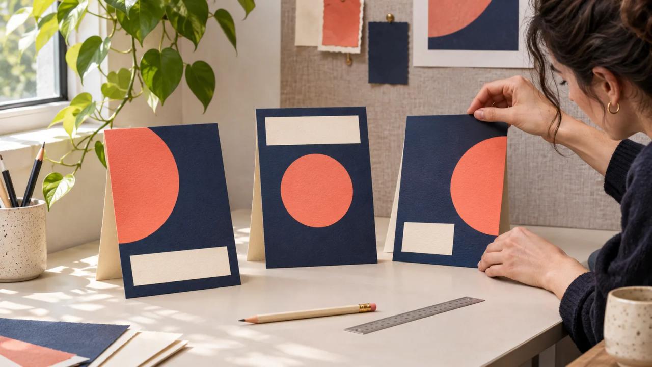
Keep the essential launch message on the easiest card to read, then use Figma’s 3D transform to give supporting cards a sense of depth. Review the exported graphic at its actual display size before approving it.
Mina, a fictional ceramics teacher, needs a launch graphic for a three-session workshop. The cards represent shaping, glazing, and finishing. Her first responsibility is to make the workshop name and booking date easy to find. The angles can help the composition once those details have a clear place.
| Card-plan field | Filled fictional decision | Review question |
|---|---|---|
| Main message | Three Saturdays of hand-built pottery | Can a reader identify the workshop from the small preview? |
| Front card | Workshop name, start date, and bowl photograph | Does the date remain readable at the final size? |
| Left support card | Shaping session and clay detail | Is its silhouette separate from the front card? |
| Right support card | Glazing session and brush detail | Does it leave the booking message visible? |
| Final placement | Wide newsletter image with linked text beneath it | Does the surrounding text carry the booking information? |
| Approval owner | Mina checks dates and photographs, designer checks layout | Did both people open the same exported file? |
This is a fictional planning sheet. It describes a design exercise and makes no claim about campaign performance.
Figma’s November 12 release notes introduce native 3D transform in Figma Design. The feature makes a timely exercise for launch graphics that use a small collection of cards.
Check access and make a flat master
Figma currently lists 3D transform and perspective as an open beta. The feature is available across plans with a Full seat and edit access. Confirm the controls appear in the file you will actually use before assigning a deadline around them.
Start with a flat version of each card. Put the workshop name, date, and photograph in place and check the spelling. Duplicate the composition for the 3D experiment. The flat master provides a clear reference whenever the new arrangement makes information harder to follow.
Keep the title and booking information in the page or email text too. That gives a reader a practical way to find and use the information when the graphic is displayed small. Write the nearby link text so it describes where the booking link leads.
Give each card one job
The front card answers what the workshop is and when it starts. The supporting cards show the kind of work participants will explore. Those roles make later layout decisions easier. When two cards compete for the same headline, simplify one before changing its angle.
Mina chooses one bowl photograph for the main card and two close details for the others. She checks that each picture belongs to the session named beside it. If a photograph needs a credit, she reserves a readable place for that credit in the surrounding content.
Keep a simple visual boundary around each card. A quiet edge and consistent spacing help reviewers see where one card ends. Check the arrangement in grayscale as an extra way to judge the hierarchy when the photographs have similar colors.
Add a small amount of rotation
Figma’s 3D effects instructions describe selecting a layer, adding 3D transform through Effects, and adjusting its X, Y, and Z rotation. The content remains editable. Perspective belongs on a parent frame, and visible depth depends on its 3D settings.
For this exercise, begin with a slight tilt on one support card. Compare it with the flat master before touching the second card. Keep the main card close to front-facing while you establish how much room the side cards need.
Change one variable per comparison. Save a named version when the spacing is useful, then try the next angle. This gives the reviewer something specific to compare. “The date is easier to read in version two” is a decision a collaborator can act on.
Check the smallest delivery first
Place the composition inside a mockup of the newsletter slot at its expected width. Read the workshop name and date without zooming. If you have to enlarge the preview to understand the launch message, make the type or hierarchy clearer.
Also check the far edges of the support cards. A narrow sliver of a photograph may add clutter without showing anything useful. Reduce the overlap or bring that detail forward until it has a visible purpose.
Open the exported image on a phone. Ask a reviewer to identify the workshop and start date before discussing the visual treatment. Record what they could read from that specific export. This is a review exercise, so avoid treating one person’s response as evidence of a wider conversion result.
Keep a clear correction path
Mina changes a session date after the first review. The designer updates the card text, exports a new version, and checks every placement that used the earlier file. A short delivery list prevents a corrected image from sitting beside an old date in the email body.
Store the flat master, the editable composition, and the chosen export together. Give the export a versioned filename that matches the review note. Include the final dimensions and destination in that note so a later designer can recreate the intended placement.
If the deadline arrives before the 3D version passes review, use the approved flat composition. The planning sheet already identifies the message and the pictures the launch needs.
Hand off the message with the artwork
Send the image with its accompanying heading, booking link, and credit text. Include a short description of the image for the publishing team. Describe the workshop cards and their purpose without repeating every decorative detail.
Adapt this card plan with the o1 guides and use the browser o1 AI workspace to work on a written launch brief. Make the design and export in Figma. The physical o1 device remains in development, as described in the current o1 specifications.
Choose one upcoming announcement, make its flat card plan, and review the smallest export before committing to the final angles.